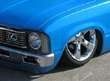
Tins back from paint...

TwistedMinis
+1y
Fuck.. I hate this bike so much. And now, after almost an 8 month battle with the owner, I'm finally assembling it. But, and a decent note, the paint looks kind of cool. If you like flames, I guess. The idea was pretty good, but from far away, it doesn't look right.. Here are some shots.
Thats a hand beat tank BTW.
Thats a hand beat tank BTW.
V
vikingdude
+1y
nice metalwork, but honestly, I dont likr that paint job. I understand what its going for, but the flame over flame colored flames on top of black flames, just isn't winning me over

Lonoma2k
+1y
looks very similar to a bike I laid out the graphics on...just not as many layer of flames..
TwistedMinis
+1y
Shane, that looks really good! I can't say I like the way this one was pulled off. So, I'm thankful it's not mine, But, its what the customer wanted...
TwistedMinis
+1y
I think it would have looked better with some pinstriping. Since the top layer of flames blends with the base. The flake in it is kind of cool, but it's not my style paintjob really.

bodydropped85
+1y
y do they call em tins were there not made of tin? y not call it a gas tank oil tank and fender?
TwistedMinis
+1y
I'm really not sure. Always heard them called that when in a group. Probably because it's easier to say that then all 3. BTW, it's a batttery box.

dragndime
+1y
I was getting ready to say that it should at least look better and more defined once the pinstripes atre laid down .....
but you said it would look better with some striping ...so im assuming they dont want it striped then.... i think that was a bad idea ....the flames just blend in together to much without stripping ....
but ya did a nice job ...top bad the owner just had a bad idea
but you said it would look better with some striping ...so im assuming they dont want it striped then.... i think that was a bad idea ....the flames just blend in together to much without stripping ....
but ya did a nice job ...top bad the owner just had a bad idea
TwistedMinis
+1y
The owner happened to have a lot of bad ideas. This one is just the icing on the cake. One of the resonas I hate this bike...

Laid GP
+1y
If the red flames were pinstriped or a different shade it'd look a lot better IMO
Related Discussions in Off-topic
Thread
Posts
Last Post
0
L
last post by
leon22 2 mo
0
FT
last post by
formula Tyres 9 mo

