Street Source is shutting down April 30th, 2026. Read the announcement
the plan of attack (do not view if your going to be negetive)
3889 views
41 replies
32 following
G
the plan of attack (do not view if your going to be negetive)

gorillagarage
+1y
Originally posted by crux131
BTW, no offense intended to anyone. It just seems to be the truth.
haha i agree we saw this dakota today and it had chrome fender trim chrome side vents and a big ass sticker that said lucy and my girl was look at that mexican truck and it was some old white cowboy dude
BTW, no offense intended to anyone. It just seems to be the truth.
haha i agree we saw this dakota today and it had chrome fender trim chrome side vents and a big ass sticker that said lucy and my girl was look at that mexican truck and it was some old white cowboy dude

lucky_brew
+1y
ill post a pic of a red mazda that is parked here in town that has a texas tail! oh- and its got a puerto rican flagged repped in the wondow!

grip
+1y
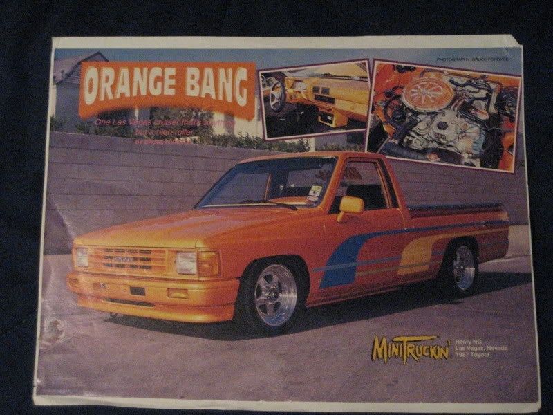
I Don't think it looks old school the way it's intended.I think it looks more like a factory stripping from the dealer in the early nintys.

slamdtaco
+1y
Edited: 3/3/2008 10:32:43 PM by SLAMDTACO
I think the hood could use some graphics. speaking of the 80s/90s, that's where our logo came from, Local Motion and our colors were pink/blue. we started in 1990
I think the hood could use some graphics. speaking of the 80s/90s, that's where our logo came from, Local Motion and our colors were pink/blue. we started in 1990

P
project_77
+1y
like the paint scheme.

JohnBoy99
+1y
The yellow/orange stripe looks good. Then the pink one looks lazy. Don't know how to describe it. I would basically take the same yellow/orange stripe, copy it, change the color and position it to where you have the yellow one. Then get the pink to lay on top of the yellow. Just my thoughts.

FreelandKustomz
+1y
Texas tail and 1/4 cab with a targa

FXDGRND
+1y
So I guess you can call it "old school".
Not sure on the color choices though. Good luck with it.


smctoy
+1y
I like it...old school to me & Ive seen alot!

Lowrider1987
+1y
I'm do paint and body work, and i say it looks good, not only by the design, but by the colors you chose. They all flow well with each other and they are all warm colors, so you have my thumbs up!
Related Discussions in Old School Minis
Thread
Posts
Last Post


